
Nerdletter Glow-Up: Endless browsing in 2026
...fewer distractions, more rabbit holes.
There was a longer break of this newsletter during post-Gamescom time. But autumn gave something new, that feels like a tasty cup of tea while looking into the golden autumn sun.
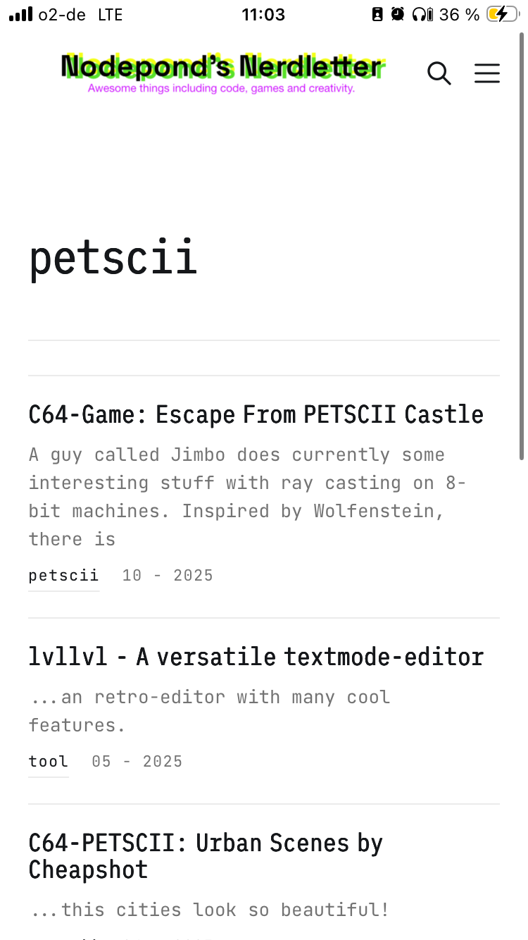
Nodepond's Nerdletter got a quiet redesign, and the approach is: get out of the way! Less visual noise, more room for the actual words and content.
I finally found the time to tweak all the details, that got untweaked in the months before. Enjoy a much better experience now: super lightweight browsing, a cleaner distinct visual style and the ability to add the Nerdletter as an "app" to your smartphone.
Tiny details, big outcome
- Better use of clickable tags at the article overview.
- On the home page: instead of one static list, you now get a rotating set of random tags to tap into, nudging you toward corners of the archive you'd normally skip.
- At the bottom of every post, there's a handful of randomly suggested articles — a little serendipity engine so one read turns into three.
- Endless scrolling right form the start at the frontpage.
Carry Nodepond's Nerdletter around... on your mobile-phone!
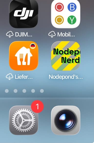
The website got a bookmark feature for mobile phone. There's a new Follow page, that shows you all ways to connect to the Nerdletter (scroll down to the bottom). Including a manual, that walks you through the process, how to add it step by step for both iOS and Android, plus a proper app icon so it doesn't look like a random bookmark blob. Tap it open and it feels like launching an app, not loading a tab.
Feels great, especially on mobile it is big fun to read the content.
If you are reading this in your inbox: go to nodepond-nerdletter.de to enjoy the new stuff!